Modern House Design in Noida I Domus 17
Introduction
Cities provide opportunities, connect people, and often make everyday life more practical. But in order to fully take advantage of the great potential of our cities, it is vital to find your calmness between the chaoses. A home that brings peace and slows down the face-paced life is a perfect place to come back to.
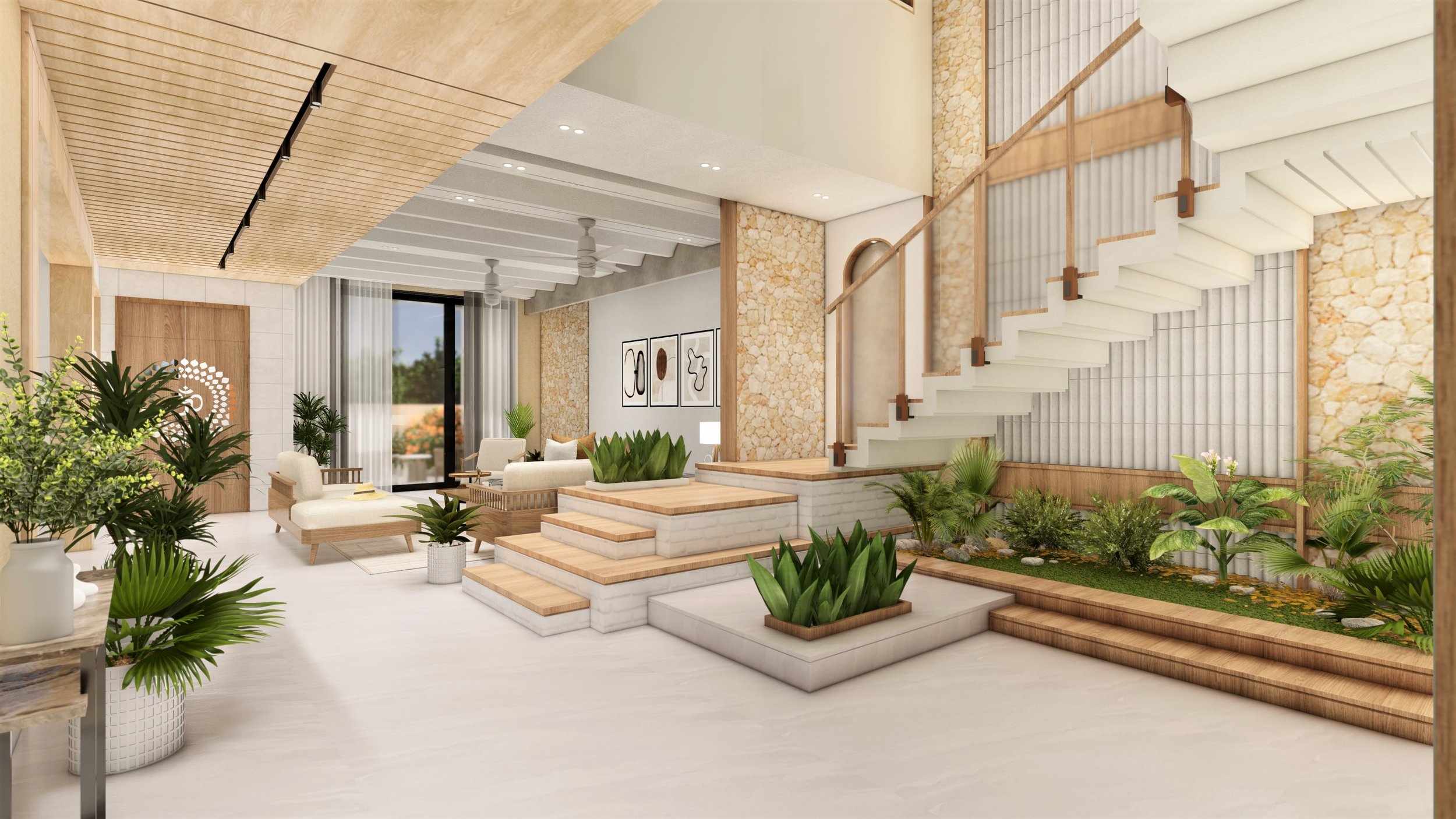
Domus 17 is a modern house in Sector 128, Noida designed & envisioned by Chaukor Studio. It is calming, tranquil, and peaceful in terms of its interiors. Bright colors are incorporated, only to enhance certain corners subtly.
The clients are a working couple and required an easy-to-maintain house with a functional and aesthetic design. People seek more serene and minimalistic sanctuaries to come home to that would keep them less stressed. The combination of functionality and beauty always harmonizes a space.
Concept
The Danish word "hygge" refers to a cozy, warm atmosphere that fosters socialization and a feeling of contentment or well-being. Hygge is communicated by Domus 17; it evokes a sense of security and comfort to unwind and relax. Sometimes in life, doing the simplest things makes you happy, relaxed, and renewed. The use of color, texture, furniture, and other small details creates a cozy and inviting atmosphere.
Getting the right design style for this project also requires reducing clutter. Clean lines and wide spaces are the key components of this design concept. But if your household is busy and you have trouble achieving that minimalist look.
Furthermore, sustainability is frequently emphasized in the design. It's a terrific green decor trend because natural materials and straightforward designs are so common. Since more and more customers favor environmentally friendly design.
Public Area
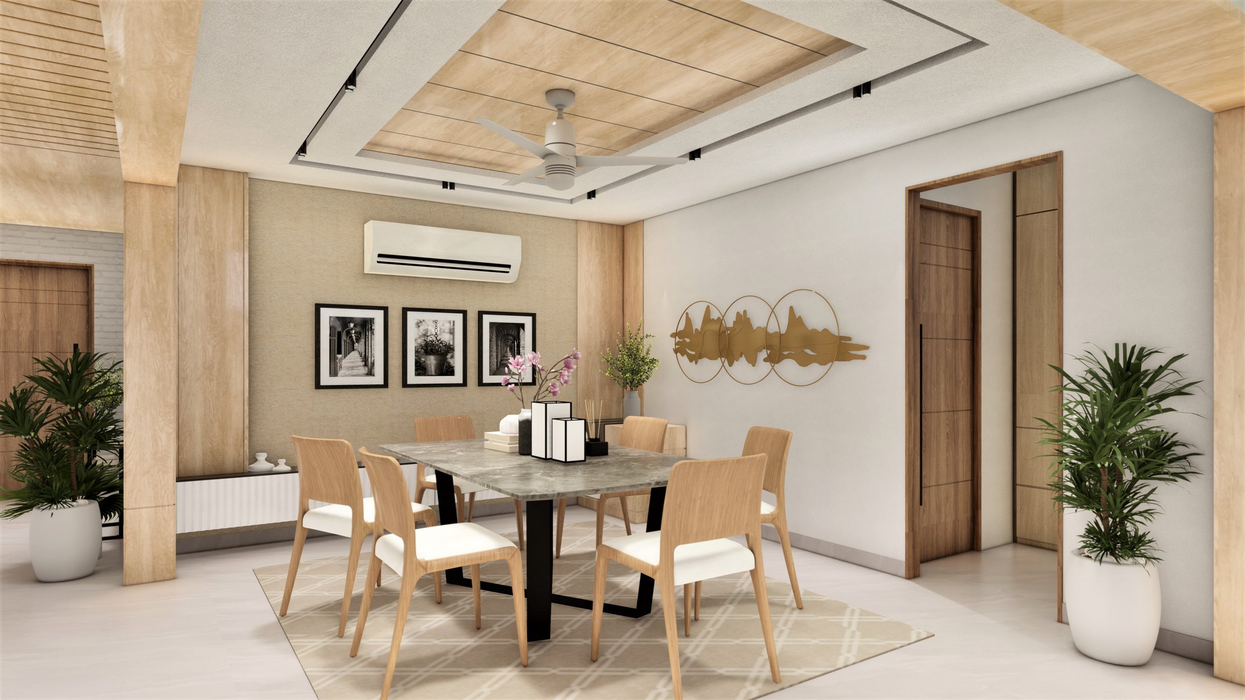
The ground floor opens up into the dining hall which connects the kitchen and family lounge. This whole area is an open and free-flowing area that connects all these public spaces together. It has functional segregation and is based on open format living. A tint of texture is added to the walls to bring a little drama to the whole space. The color tones are more whites and neutrals.
The kitchen covers a large area and invites lots of daylight to illuminate the whole space. The cabinets chosen are of light color to blend the whole interiors together. The dark grey tones of the kitchen slab and the wall on the working station break the monotony by creating contrast and activating the Scandinavian palettes of the interior.
Various artworks are used to draw attention to the walls. It makes the whole place look more colorful and introduces a ton of texture.
Private Area
Your bedroom is the only place you can unwind after a stressful day, no matter where you reside in the world. The bedroom should always feel like a haven, thus such a warm and cozy design is ideal! Uncluttered surfaces and a less-is-more philosophy are hallmarks of the whole project. The clean, uncomplicated, and understated design will produce a tranquil and calming ambiance.
Conclusion
The goal of this project was to highlight a feeling of home; where you can relax and embark a feeling of gratitude and comfort. The simple interiors are integrated while embracing the great and open outdoors which impart tons of daylight.
Reetika Tandon, writer
About the Author
Reetika is a young architect who is fascinated by the tales behind all pieces of art. She enjoys sharing those stories and giving them her own touch. She aims to write and communicate in a way that is instructive, easy to read, and understandable to each and everyone.


